Anthem Motif Design System
A health insurance company in the midst of an evolution into a healthcare tech platform needed a design system to unify experience design across all of its apps, portals and websites.

Project details
Discovery Process
Relatively new to the UX space at the time, I approached this project differently than expected. But my leaders were glad I did. Design systems only work when they are universally adopted and consistently respected. They function internally to unify, but they function externally to inspire and attract top talent. My goal after competitive analysis was to create a design system brand and experience that my colleagues didn't just submit to, but actually loved.
Experience Design
Although I created user flows and wireframes (lost in the decline of Sketch) to create the full web app, after completing a thorough competitive analysis, I led with storytelling, ultimately rooting the name and visual design in the musical connotations of Anthem.
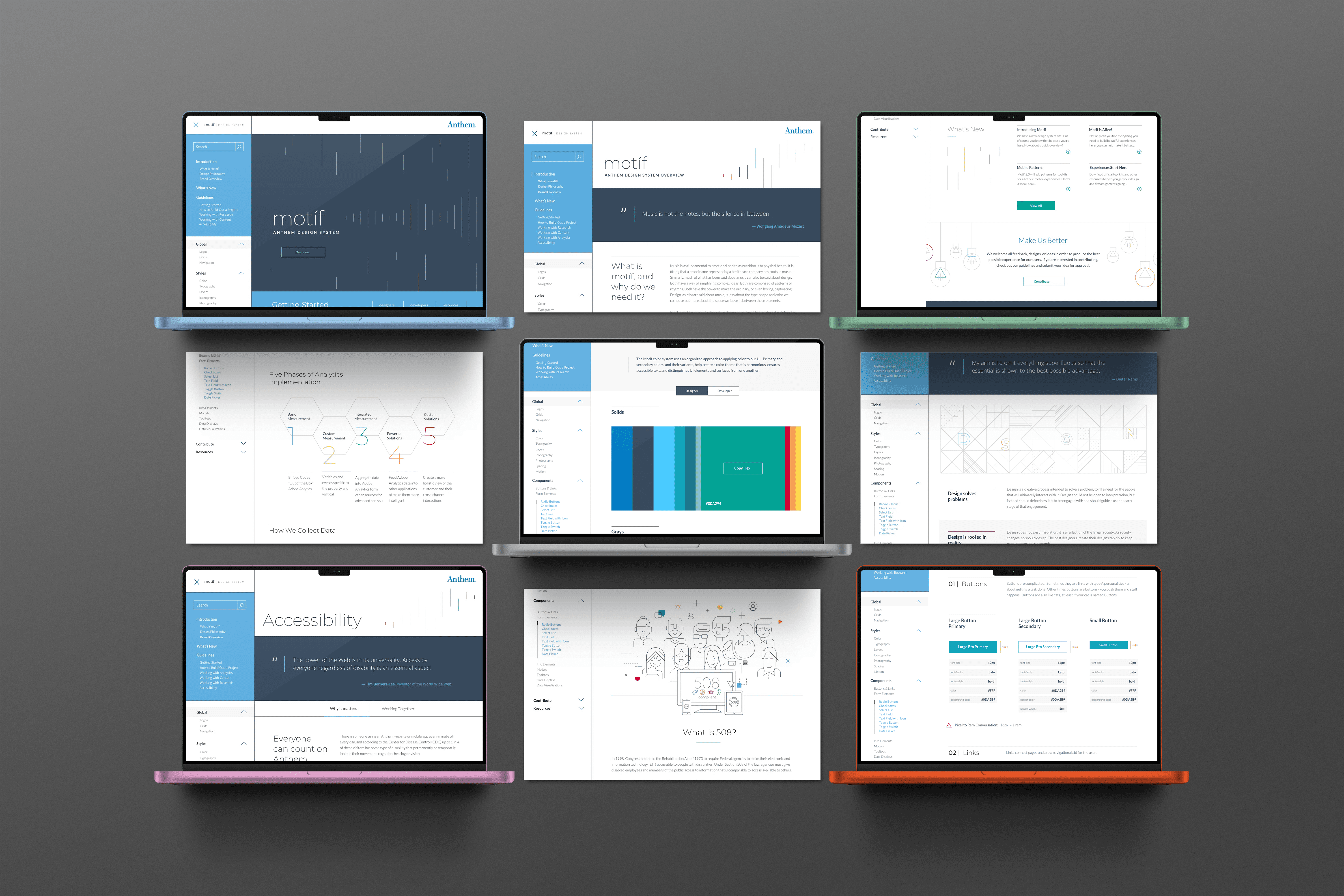
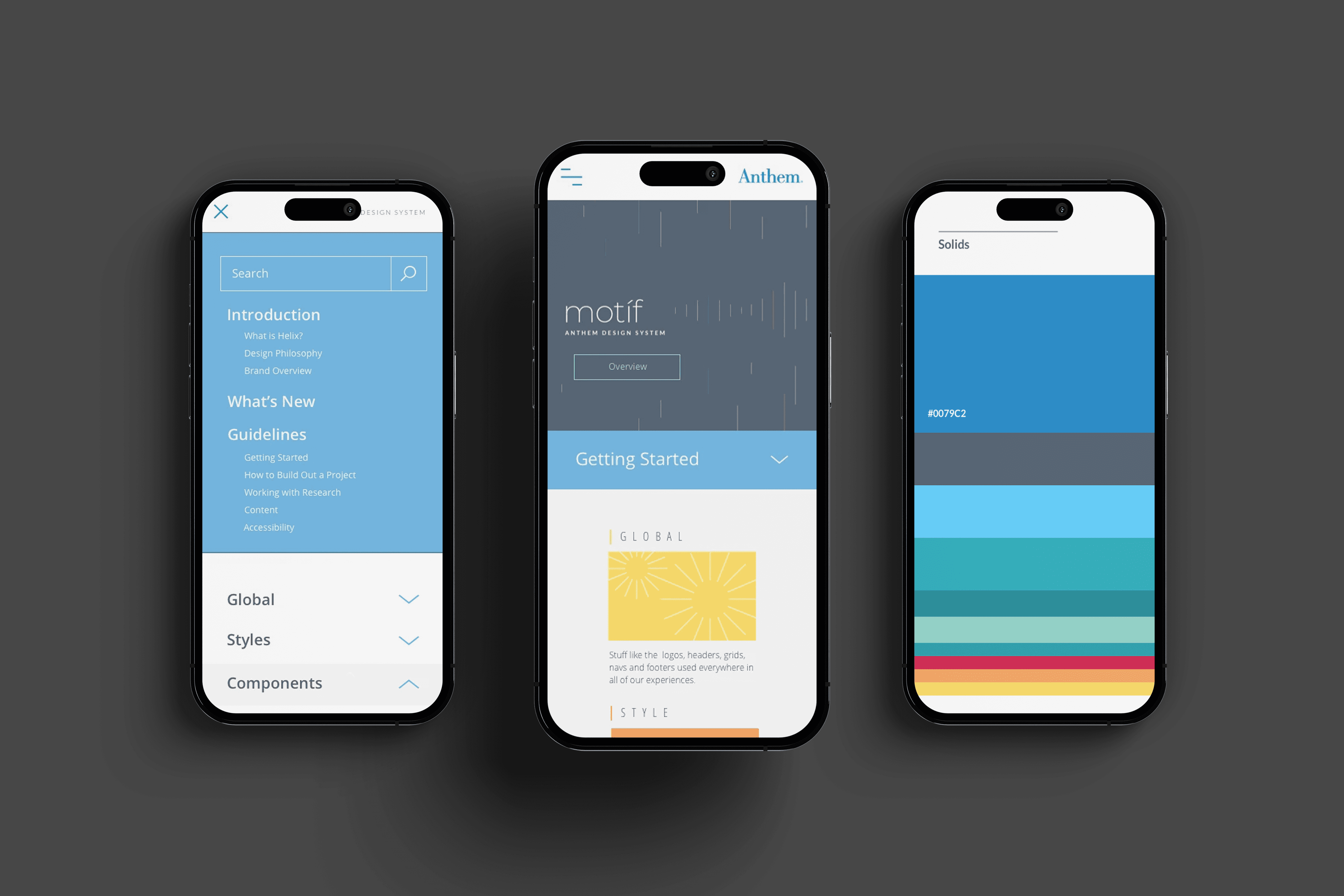
Design System Implementation
The concept was approved and adopted with much fanfare and quickly "Motif" became a substitute for "design system" among designers, developers, product managers, and executives alike. I defined the patterns and their usage guidelines, designed the initial library, and even wrote the storytelling copy. Motif was more than a design system. It was a beloved brand experience in and of itself.
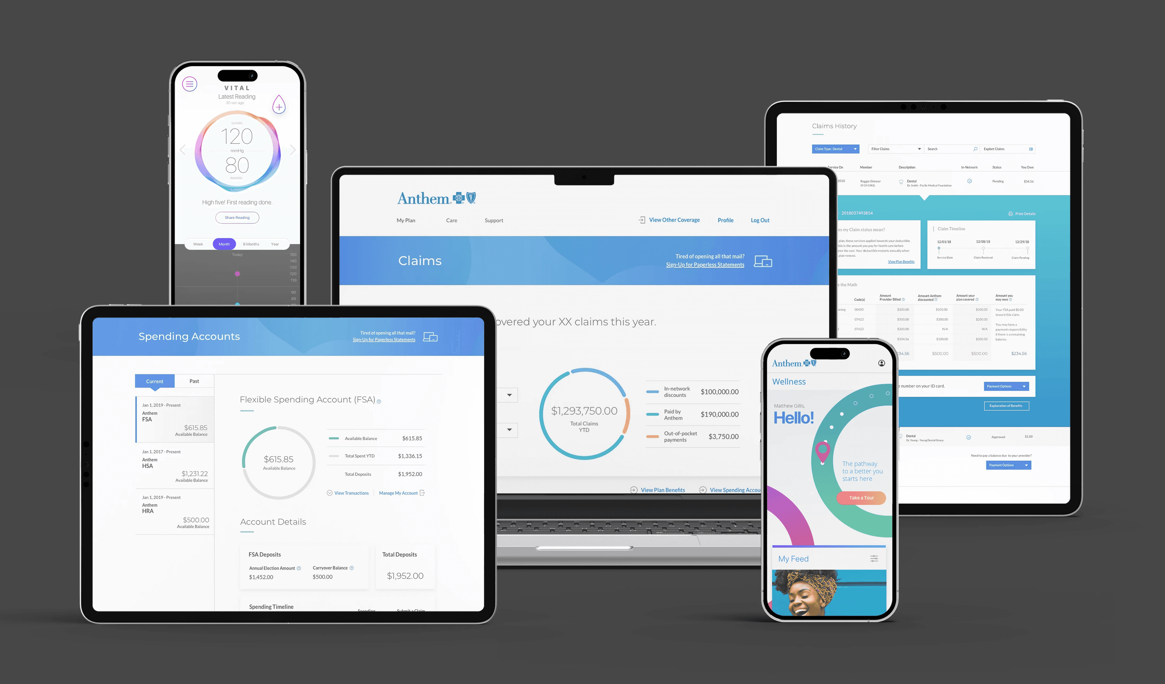
Leveraging the design system and customer data, I solved problems and created new opportunities including improving the Claims and Spending Accounts customer portal experiences, pitching my own "rewards program" app that would leverage brand partnerships to reward customers for being loyal, not to Anthem, but to their own health, and partnering with the Innovation Studio to prototype a Blockchain-based app empowering doctors to monitor patient blood pressure remotely.
